Krimside: A Groovy Serif Font for Bold Digital Branding
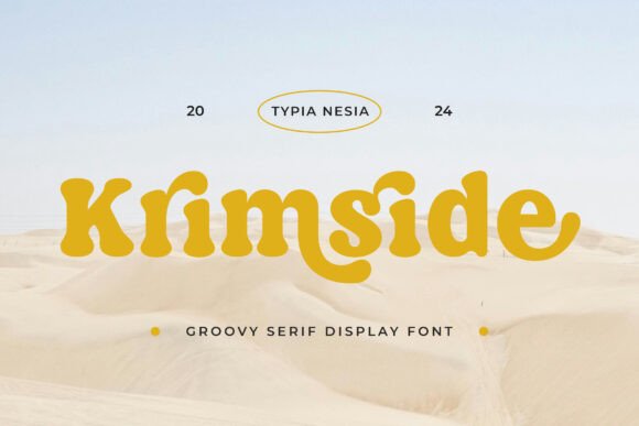
As a web designer who ships landing pages, SaaS dashboards, and boutique e-commerce sites, I’m constantly balancing personality with performance. That’s why Krimside stands out—not as another decorative script or overused sans serif, but as a groovy serif font that delivers both character and clarity in digital spaces. Its playful curves and confident stroke weight make it ideal for projects where brand voice matters as much as usability.
Krimside isn’t built for body copy—it’s a display serif font designed to command attention. Think of it as your visual headline partner: the kind of typeface you’d use for a hero section title on a creative portfolio, a bold CTA button on a coaching sales page, or the shop name banner on a handmade goods store. Its retro charm comes through in the subtle flares, soft terminals, and rhythmic contrast—but it’s grounded with clean proportions and generous x-height, which translates well on screens at 24px and above.
In practice, Krimside excels where hierarchy and tone intersect. On a product landing page, pairing Krimside with a neutral sans serif like Inter or Manrope creates immediate visual rhythm: the serif sets the mood (friendly, confident, human), while the sans handles readability for feature lists, pricing tables, and form labels. This pairing works especially well for editorial-style SaaS websites, course platforms, or independent creator sites aiming for warmth without sacrificing polish.
For online stores, Krimside shines in high-impact zones—shop banners, category headers, limited-edition drop announcements, and logo lockups. It avoids the sterility of generic serifs and the fragility of many script fonts, making it more versatile than most display faces. Try it over a soft gradient or textured background in a hero banner: its bold presence holds up even with subtle image overlays, and its letterforms remain legible on mobile viewports when sized appropriately (minimum 28px on iOS/Safari, 32px on Android for optimal tap-target spacing).
Readability on dark mode? Yes—with caveats. Krimside performs reliably on charcoal or deep navy backgrounds when used at larger sizes and with sufficient letter-spacing (0.5–1.2px). Avoid thin weights or tight tracking in low-light UIs; stick to the Regular or Bold variants. For light backgrounds, its open counters and balanced spacing mean it won’t visually “sink” — especially useful for blog headers, testimonial quotes, or newsletter subject lines.
Where Krimside truly supports conversion is in emotional signaling. Unlike ultra-minimalist fonts that can feel detached, or overly ornate serifs that distract, Krimside conveys approachability and intentionality. On a wellness brand’s homepage, it signals care and creativity. On a design agency’s case study page, it adds editorial weight without pretension. And on a digital product’s empty state illustration (“No items yet”), it makes utility feel human—not robotic.
It’s not just about aesthetics—it’s about consistency across touchpoints. When you use Krimside for your website’s main heading, then reuse it identically in Figma for app onboarding screens, Canva for social banners, and Adobe Express for email headers, you reinforce brand recall. That continuity matters more than ever as users move between devices and platforms. Just ensure your license covers webfont embedding (WOFF2), app usage, and client deliverables—most premium font licenses include these, but always verify before deploying to production.
Krimside includes multiple weights (Light, Regular, Bold) and supports Latin-based languages including extended diacritics—enough for English, Spanish, French, Portuguese, and German markets. It doesn’t include variable axes or stylistic alternates, which keeps file size lean (<120KB total for all weights) and loading predictable. No surprises in Lighthouse audits.
Pairing strategy matters. Use Krimside for headings, logos, and short impactful phrases only. Never for paragraphs, navigation menus under 18px, or dense data tables. Complement it with a highly legible sans serif for UI text—something with strong hinting and OpenType features like Inter, IBM Plex Sans, or Work Sans. For editorial blogs or content-heavy sites, consider using it alongside a secondary serif (like Cormorant Garamond) for pull quotes—just keep line length tight and leading generous to preserve scannability.
Real-world examples where Krimside delivers: a freelance illustrator’s portfolio site using it for project titles overlaid on full-bleed illustrations; a ceramic studio’s Shopify homepage banner with “New Glaze Collection” set in Krimside Bold; a UX writing course landing page using it for the headline “Write Interfaces People Trust”; a newsletter footer signature (“— Built with care & Krimside”). In each case, the font reinforces tone without slowing down comprehension.
One practical note: test rendering across browsers early. Safari sometimes renders heavier serifs with tighter default kerning—add letter-spacing: 0.8px to h1–h3 elements if letters feel crowded. Also, avoid setting Krimside in all caps for long phrases—it loses its groove. Let those lowercase curves breathe.
If you’re building a digital brand that values authenticity over algorithmic neutrality, Krimside earns its place in your type system. It’s not a one-size-fits-all solution, but it’s a precise tool—for moments where you want users to pause, recognize, and remember. Not because it shouts, but because it speaks with unmistakable character.
And yes—it’s a serif font. But not the kind your grandfather used in brochures. This is a modern typography choice: rooted, responsive, and ready for the next wave of branded web experiences.